노는게 제일 좋습니다.
tkinter grid method 본문
The Tkinter Grid Geometry Manager
The Grid geometry manager puts the widgets in a 2-dimensional table.
Grid라고 하는 geometry manager는 위젯을 2차원의 표에 놓습니다.
The master widget is split into a number of rows and columns, and each “cell” in the resulting table can hold a widget.
마스터위젯은 row와 column에 해당하는 숫자로 나뉘고, 완성된 표에서 각각의 '셀'(표의 한 칸)은 위젯을 잡아둡니다.
When to use the Grid Manager
The grid manager is the most flexible of the geometry managers in Tkinter.
그리드 매니저는 tkinter의 geometry manager중 가장 유연합니다.(융퉁성 있음)
If you don’t want to learn how and when to use all three managers, you should at least make sure to learn this one.
만약 당신이 세 가지의 모든 지오매트리 매니저를 쓰는 때와 방법을 공부하고 싶지 않으면, 반드시 그리드매니저만이라도 공부하세요.
The grid manager is especially convenient to use when designing dialog boxes.
그리드 매니저는 특히 다이얼로그 박스들들 디자인할 때 사용하기에 편리합니다.
** 다이얼로그 박스가 뭐여? : https://en.wikipedia.org/wiki/Dialog_box
If you’re using the packer for that purpose today, you’ll be surprised how much easier it is to use the grid manager instead.
만약 당신이 다이얼로그 박스를 만들기 위해 packer를 쓰고 있다면, packer대신에 그리드를 쓰는게 얼마나 쉬운지 알고는 깜짝 놀랄겁니다.
Instead of using lots of extra frames to get the packing to work, you can in most cases simply pour all the widgets into a single container widget, and use the grid manager to get them all where you want them. (I tend to use two containers; one for the dialog body, and one for the button box at the bottom.)
많은 extra frames to get the packing to work를 쓰는 것 대신, 당신은 대부분의 경우에 간단하게 여러 위젯을 하나의 컨테이너 위젯에 담을 수 있고, 하기
(본인은 주로 총 두 개의 컨테이너를 쓰는데, 하나는 다이얼로그 바디를 위해, 또 하나는 아래의 버튼박스를 위해 씁니다.)
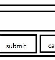
Consider the following example:
이 예를 한 번 보세요

Creating this layout using the pack manager is possible, but it takes a number of extra frame widgets, and a lot of work to make things look good.
pack매니저를 사용해서 저 레이아웃(구조)를 짜는 것도 가능하지만, 더 많은 틀 위젯을 필요로 하고 예쁘게 보이기 위해서는 더 많은 노가다를 필요로 합니다.
If you use the grid manager instead, you only need one call per widget to get everything laid out properly (see next section for the code needed to create this layout).
당신이 pack매니저 대신 그리드 매니저를 사용한다면, 당신은 모든 것들이 적절하게 놓이도록 하기 위해 위젯마다 그저 하나의 call만 필요합니다. (이 레이아웃을 만드는데 필요한 코드를 보려면 다음 섹션을 보세요.)
Warning: Never mix grid and pack in the same master window.
경고 : 같은 마스터 윈도우 내에서 그리드와 팩(pack)을 섞어 쓰지마세요.
Tkinter will happily spend the rest of your lifetime trying to negotiate a solution that both managers are happy with.
그랬다가는 tkinter가 그 둘을 섞는 방법을 찾는데 어마어마한 시간을 써버립니다. 아마 남은 인생을 다 쓸지도..
Instead of waiting, kill the application, and take another look at your code. A common mistake is to use the wrong parent for some of the widgets.
그걸 멍하니 기다리기 보다는 프로그램을 종료하고, 당신의 코드를 다시 보세요. 위젯들을 위해 잘못된 parent를 사용하는 것은 흔한 실수입니다.
Patterns #
Using the grid manager is easy.
그리드 매니저를 쓰는 것은 간단합니다.
Just create the widgets, and use the grid method to tell the manager in which row and column to place them.
위젯을 만들고, 위젯들이 놓일 row와 column을 정하기 위해 grid 메소드를 사용하세요
You don’t have to specify the size of the grid beforehand; the manager automatically determines that from the widgets in it.
당신은 미리 그리드의 크기를 정할 수 없습니다. 매니저가 자동적으로 위젯을 보고 크기를 결정합니다.
    Label(master, text="First").grid(row=0)
    Label(master, text="Second").grid(row=1)

    e1 = Entry(master)
    e2 = Entry(master)

    e1.grid(row=0, column=1)
    e2.grid(row=1, column=1)
Note that the column number defaults to 0 if not given.
column의 값이 주어지지 않으면 기본값은 0입니다.
Running the above example produces the following window:
위의 예제를 실행하면 아래와 같은 윈도우를 만듭니다.

Empty rows and columns are ignored.
비어있는 row와 column은 무시됩니다.
The result would have been the same if you had placed the widgets in row 10 and 20 instead.
당신이 row를 10과 20으로 놓아도 결과는 같습니다.
Note that the widgets are centered in their cells.
위젯들이 각각의 셀에서 가운데 정렬된 것에 주목하세요.
You can use the sticky option to change this; this option takes one or more values from the set N, S, E, W.
당신은 가운데 정렬된 상황을 바꾸기 위해 sticky옵션을 사용할 수 있습니다. 이 옵션은 N,S,E,W 중에 하나 이상의 값을 필요로 합니다.
To align the labels to the left border, you could use W (west):
라벨(label)들을 왼쪽정렬하기 위해, W를 사용합니다. (W는 서쪽west의 의미입니다.)
    Label(master, text="First").grid(row=0, sticky=W)
    Label(master, text="Second").grid(row=1, sticky=W)

    e1 = Entry(master)
    e2 = Entry(master)

    e1.grid(row=0, column=1)
    e2.grid(row=1, column=1)

You can also have the widgets span more than one cell.
위젯에 한 셀보다 더 큰 공간을 줄 수도 있습니다.
The columnspan option is used to let a widget span more than one column, and the rowspan option lets it span more than one row.
columnspan(칼럼스판)이라는 옵션은 위젯이 한 칼럼 이상의 공간을 차지하도록 하고, rowspan(로우스판)이라는 옵션은 위젯이 한 로우(줄) 이상의 공간을 차지하도록 하는데 쓰입니다.
The following code creates the layout shown in the previous section:
다음의 코드는 이전 섹션에서 보여진 레이아웃을 만듭니다.
    label1.grid(sticky=E)
    label2.grid(sticky=E)

    entry1.grid(row=0, column=1)
    entry2.grid(row=1, column=1)

    checkbutton.grid(columnspan=2, sticky=W)

    image.grid(row=0, column=2, columnspan=2, rowspan=2,
               sticky=W+E+N+S, padx=5, pady=5)

    button1.grid(row=2, column=2)
    button2.grid(row=2, column=3)
There are plenty of things to note in this example.
이 예제에는 중요한 것이 아주 많습니다.
First, no position is specified for the label widgets.
첫째, label위젯을 위한 위치가 없습니다.
In this case, the column defaults to 0, and the row to the first unused row in the grid.
이 경우, 칼럼의 기본값은 0이고, 로우(row)는 그리드에서 사용되지 않은 가장 작은 숫자로 지정됩니다.
Next, the entry widgets are positioned as usual, but the checkbutton widget is placed on the next empty row (row 2, in this case), and is configured to span two columns.
다음으로, 엔트리 위젯(텍스트를 적을 수 있는 위젯)은 일반적인 것과 같이 위치되지만, 체크버튼 위젯은 다음의 빈 로우에 위치하고(이 예제의 경우에는 2번 로우), 두 개의 칼럼을 차지합니다.
The resulting cell will be as wide as the label and entry columns combined.
결과 셀은 라벨 위젯과 엔트리 위젯의 칼럼을 합한 만큼 자리를 차지합니다.
The image widget is configured to span both columns and rows at the same time.
이미지 위젯은
The buttons, finally, is packed each in a single cell:
마지막으로, 버튼들은 각각 하나의 셀이 패킹되어있습니다.

Reference #
- Grid (class) [#]
-
Grid geometry manager. This is an implementation class;
-
그리드 지오메트리 매니저입니다. 이것은 implementation class입니다.
-
*** 이곳에 따르면 implementation class는 An implementation class is a class that may have attributes, associations, operations, and methods. An implementation class defines the physical implementation of objects of a class. 라고 합니다.
-
all the methods described below are available on all widget classes.
-
아래에 설명되어있는 모든 메소드는 모든 위젯 클래스에서 사용가능합니다.
- grid(**options) [#]
-
Place the widget in a grid as described by the options.
-
위젯을 옵션으로써 그리드의 어떤 위치에 놓습니다.
- **options
- Geometry options.
- column=
- Insert the widget at this column. Column numbers start with 0. If omitted, defaults to 0.
- 위젯을 이 칼럼(column)에 놓습니다. 칼럼의 숫자는 0부터 시작하며, 생략할 경우 기본값은 0입니다.
- columnspan=
- If given, indicates that the widget cell should span multiple columns. The default is 1.
- 만약 이 속성을 쓸 경우, 위젯 셀이 여러 칼럼에 걸쳐있음을 나타냅니다. 기본값은 1입니다.
- in=
-
Place widget inside to the given widget. You can only place a widget inside its parent, or in any decendant of its parent. If this option is not given, it defaults to the parent.
-
위젯을 주어진 위젯 내에 놓습니다. 놓으려는 위젯의 부모에만, 또는 부모의 decendant 한 것에만 놓을 수 있습니다. 이 옵션을 사용하지 않을 경우 기본 값은 부모입니다.
Note that in is a reserved word in Python. To use it as a keyword option, append an underscore (in_).
-
주의 : in 은 파이썬의 예약어(for나 if같이 미리 정의된 키워드)이므로, in을 쓰려면 in_의 형태로 써야합니다.
- in_=
- Same as in. See above.
- ipadx=
- Optional horizontal internal padding. Works like padx, but the padding is added inside the widget borders. Default is 0.
- 선택적인 가로줄 내부의 패딩(빈공간)입니다. padx와 유사하게 동작하지만, 패딩이 위젯 경계선 내부에 추가됩니다. 기본 값은 0입니다.
- ipady=
- Optional vertical internal padding. Works like pady, but the padding is added inside the widget borders. Default is 0.
- padx=
- Optional horizontal padding to place around the widget in a cell. Default is 0.
- pady=
- Optional vertical padding to place around the widget in a cell. Default is 0.
- row=
- Insert the widget at this row. Row numbers start with 0. If omitted, defaults to the first empty row in the grid.
- rowspan=
- If given, indicates that the widget cell should span multiple rows. Default is 1.
- sticky=
-
Defines how to expand the widget if the resulting cell is larger than the widget itself. This can be any combination of the constants S, N, E, and W, or NW, NE, SW, and SE.
-
위젯이 어떤 방향으로 정렬되고, 어떤 방향으로 확대될 것인지를 정의합니다.
For example, W (west) means that the widget should be aligned to the left cell border. W+E means that the widget should be stretched horizontally to fill the whole cell. W+E+N+S means that the widget should be expanded in both directions. Default is to center the widget in the cell.
-
예를 들어, W의 경우 위젯이 왼쪽에 정렬됩니다. W+E는 좌우로 확대됨을 뜻합니다. W+E+N+S는 사방으로 확대됨을 뜻합니다. 기본값은 셀의 중앙입니다.
- grid_bbox(column=None, row=None, col2=None, row2=None) [#]
-
The grid_bbox method.
- column
- row
- col2
- row2
- grid_columnconfigure(index, **options) [#]
-
Set options for a cell column.
To change this for a given widget, you have to call this method on the widget’s parent.
- index
- Column index.
- **options
- Column options.
- minsize=
- Defines the minimum size for the column. Note that if a column is completely empty, it will not be displayed, even if this option is set.
- pad=
- Padding to add to the size of the largest widget in the column when setting the size of the whole column.
- weight=
- A relative weight used to distribute additional space between columns. A column with the weight 2 will grow twice as fast as a column with weight 1. The default is 0, which means that the column will not grow at all.
- grid_configure(**options) [#]
-
Same as grid.
- grid_forget() [#]
-
Remove this widget from the grid manager. The widget is not destroyed, and can be displayed again by grid or any other manager.
- grid_info() [#]
-
Return a dictionary containing the current cell options for the cell used by this widget.
- Returns:
- A dictionary containing grid grid management options.
- grid_location(x, y) [#]
-
Returns the grid cell under (or closest to) a given pixel.
- x
- y
- Returns:
- A tuple containing the column and row index.
- grid_propagate(flag) [#]
-
Enables or disables geometry propagation. When enabled, a grid manager connected to this widget attempts to change the size of the widget whenever a child widget changes size. Propagation is always enabled by default.
- flag
- True to enable propagation.
- grid_remove() [#]
-
Remove this widget from the grid manager. The widget is not destroyed, and can be displayed again by grid or any other manager.
- grid_rowconfigure(index, **options) [#]
-
Set options for a row of cells.
To change this for a given widget, you have to call this method on the widget’s parent.
- index
- Row index.
- **options
- Row options.
- minsize=
- Defines the minimum size for the row. Note that if a row is completely empty, it will not be displayed, even if this option is set.
- pad=
- Padding to add to the size of the largest widget in the row when setting the size of the whole row.
- weight=
- A relative weight used to distribute additional space between rows. A row with the weight 2 will grow twice as fast as a row with weight 1. The default is 0, which means that the row will not grow at all.
- grid_size() [#]
-
Returns the current grid size for the geometry manager attached to this widget. This is defined as indexes of the first empty column and row in the grid, in that order.
- Returns:
- A 2-tuple containing the number of columns and rows.
- grid_slaves(row=None, column=None) [#]
-
Returns a list of the “slave” widgets managed by this widget. The widgets are returned as Tkinter widget references.
- Returns:
- A list of widgets.
'Python > 기타 공부' 카테고리의 다른 글
| Tkinter PhotoImage resize (1) | 2016.09.04 |
|---|---|
| Tkinter How to use grid for PhotoImage (0) | 2016.09.04 |
| tkinter 처음하기 (0) | 2016.09.03 |
| python two-dimensional array (0) | 2016.08.21 |
| pygame 스프라이트와 사운드 입히기 (5) | 2016.02.08 |